
Tuesday 29 September 2015
Monday 28 September 2015
Moodboard


Hannah and I planned a moodboard revolving around our chosen genre of EDM. The name of our artist 'L|NES' and his biography is displayed in the centre surrounded by images of inspiration for our artist. His image and what is he likely to wear is shown on the moodboard such as Converse shoes and bright t shirts. Artists such as Dillon Francis and Avicii are also featured on the moodboard as we have taken their music videos as our inspiration.


Tuesday 22 September 2015
Digipak Analysis: Paramore
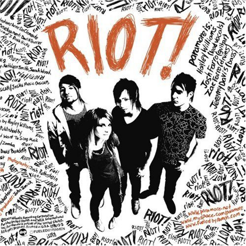
Paramore's 2008 album, 'Riot!' features the American rock band surrounded by the word 'riot'. It can be suggested the layout of the words creates a disturbance for the audience as it is placed unevenly around the sides of the album. The placement of the band in the middle could also suggest they are the people creating the 'riot'. A high angle shot is used, this could connote the audience looking down upon Paramore. This could further emphasis society looking down upon rebellion but the band does not show any sign of caring which is shown through their body language. The lead singer, Hayley Williams, is shown with her hand behind her back smiling at the camera, also the male members are shown with their hands in their pockets nonchalantly as if they do not care. Hayley William's is framed to be slightly in front of the other members, suggesting to the audience that she is more important.
In addition, the band is also in black and white with the only thing shown in colour is the album title which suggests the audience's attention should be solely focused on the title instead of the band. The typography is presented to look as if it is graffiti- this further emphasises the idea of rioting and rebelling. Around the cover, merged with the word 'riot' is information about the band and CD. For example, on the right hand side near the exclamation mark of 'Riot!' the text refers to the members of Paramore. This use of incorporating the different texts with the same typography could make an impact as it is almost hidden within the 'riot' which could further emphasise the destruction the band is going to cause.
Throughout the album, there is a clear colour scheme of orange, black and orange used. This is effective as the orange clearly stands out against black and white and the audience's attention is able to be immediately grabbed with the vibrant colour. The use of orange could also reflect Paramore's image of being a fun, rock band.

The back of the album is similar to the front as it shows repetition of the word 'riot' across the back. The image of the band is once again in black and white yet they are positioned to grab the audience's attention as there is a noticeable contrast between Paramore and the repetitive words in the background. The important text- the track listing- is presented in orange which also catches the audiences attention. The barcode of the album is positioned on the top right corner to which the text also surrounds which could further emphasise the idea of rebelling as there is no blank spaces between the barcode and the text.

The style of the CD is similar to the front and back images of the album which presents the albums use of continuity. 'Riot!' is once again sprawled over the CD repeatedly with the album title displayed in the largest type in orange- this catches the audience's attention as it stands out against the black and white.

Furthermore, the colour scheme is also followed inside the digipak. The lyrics page is solely black and white which further emphasises their rock/emo image as, stereotypically, black is normally associated with 'emos'. The layout of the lyrics in each song is different, some lyric sections are sideways and some are upright- this could add to the 'riot' of the album and add a sense of chaos. Featuring two of the members on the page, the contrast between the image and text draws the audience's attention on the two members instead of the lyrics. A handwritten, scratched like type is used for the lyrics which could further refer to their genre of music- rock- as this type of text could be seen as threatening and aggressive.


The poster for Paramore's 'Riot' follows the same style as the album with the use of black and white images and type with the exception of the orange typography of the album name 'RIOT!'. Similarly, the band is surrounded by the word 'riot' constantly repeating itself across the whole poster- this again creates a sense of chaos as the words are randomly placed on the poster.
Digipak Analysis: Lana Del Ray
Lana Del Ray's 2012 indie pop album could appeal to teenagers and young adults who enjoy her 60s/vintage like image and music style.

The front cover of her album, 'Born To Die', features a medium close up of Del Ray of which only her face and upper body is shown. It can be suggested this use of a close up is an example of Laura Mulvey's Male Gaze, as the artist's costume consists of a white shirt suggesting the artist is simple yet a red bra can also be seen underneath- this could connote a sexy image of Del Ray. In addition, the artist is framed in the centre of the shot, our eyes are immediately drawn to her as she is the focus of the audience's attention. Her minimalistic makeup, hair and outfit could reflect upon her simplistic yet vintage style, also her solemn expression could reflect on her music and could also create a visual style to which her audience will recognise her for.
Lana Del Ray has been pictured outside which could be a typical feature within the indie genre. The use of setting could display her as exploring the world through her music and encountering experiences which shape her to be the artist she is. The colour scheme of the image is bright and fresh which could reflect upon 'Born To Die' being her first album release and target her young audience.
The album uses simple, block typography for her artist and album title. This style is also seem throughout her other proceeding albums and adverts which enables a wider audience to recognise her brand. The artist title is noticeable bigger than the album title which could reflect upon this album being her first therefore it is more important for an audience to see Del Ray's name in order for more exposure. Furthermore, the album title is placed at the bottom, under the artist's chest which further sexualises the artist. A similar colour to her lips is used for the album title which could draw the audience's attention as the bright colour used is vibrant against the soft background.

The back of the album displays the track listings which is- similar to the front of the album- simplistic. This further connotes the simplicity of Lana Del Ray's album. A noticeable feature within the back cover is the drastic change of colour scheme which went from the use of the soft, bright and fresh colours to more bolder colours. The use of a red background could connote Del Ray's femininity- it's colour scheme could also reflect upon the albums emotional themes and lyrics. As the artist's face is not shown on the back of the album, it can be suggested this was used in order for the audience to focus solely on the tracks listed.

The inside of the digipak features a similar image of Del Ray seen on the front cover of the album. A mid close up is used which allows the audience to focus on the artist's image and body language. This image is displayed through the use of two windows which could show the artist's importance in her image along with her music. Similarly to the front cover, the front cover uses young and soft colours which could connote a natural atmosphere. This contrasts with the boldness of the back cover which could suggest Del Ray is more than what is shown on the front cover and she will continue to show her audience the different sides to her musical image.

Additionally, the inside of the digipak also contains a fold out which consists of the lyrics to each song. A type writer styled typography is used to display the lyrics- this creates a vintage and retro look which could refer to Lana Del Ray's vintage visual image. The paper is also shown to be worn out which further reflects upon the artist's image. Blood splatters are also shown on the lyric pages which could symbolise the artist's relationships and love dying. This use of blood could be compared to the back of the album which is also dark and blood. This could also mark the artist's emotional turbulences in her life.

The CD is simple which follows the simplistic image of the overall album- the use of three roses on a white background makes the vibrancy of the red more prominent and catches the audience's attention. The roses could symbolise the themes of love which could be heavily referred to through Del Ray's music. It's colour scheme of red on white could suggest a sense of innocence and could also refer to innocent love to which Del Ray could have encountered previously.

The front cover of her album, 'Born To Die', features a medium close up of Del Ray of which only her face and upper body is shown. It can be suggested this use of a close up is an example of Laura Mulvey's Male Gaze, as the artist's costume consists of a white shirt suggesting the artist is simple yet a red bra can also be seen underneath- this could connote a sexy image of Del Ray. In addition, the artist is framed in the centre of the shot, our eyes are immediately drawn to her as she is the focus of the audience's attention. Her minimalistic makeup, hair and outfit could reflect upon her simplistic yet vintage style, also her solemn expression could reflect on her music and could also create a visual style to which her audience will recognise her for.
Lana Del Ray has been pictured outside which could be a typical feature within the indie genre. The use of setting could display her as exploring the world through her music and encountering experiences which shape her to be the artist she is. The colour scheme of the image is bright and fresh which could reflect upon 'Born To Die' being her first album release and target her young audience.
The album uses simple, block typography for her artist and album title. This style is also seem throughout her other proceeding albums and adverts which enables a wider audience to recognise her brand. The artist title is noticeable bigger than the album title which could reflect upon this album being her first therefore it is more important for an audience to see Del Ray's name in order for more exposure. Furthermore, the album title is placed at the bottom, under the artist's chest which further sexualises the artist. A similar colour to her lips is used for the album title which could draw the audience's attention as the bright colour used is vibrant against the soft background.
The back of the album displays the track listings which is- similar to the front of the album- simplistic. This further connotes the simplicity of Lana Del Ray's album. A noticeable feature within the back cover is the drastic change of colour scheme which went from the use of the soft, bright and fresh colours to more bolder colours. The use of a red background could connote Del Ray's femininity- it's colour scheme could also reflect upon the albums emotional themes and lyrics. As the artist's face is not shown on the back of the album, it can be suggested this was used in order for the audience to focus solely on the tracks listed.
The inside of the digipak features a similar image of Del Ray seen on the front cover of the album. A mid close up is used which allows the audience to focus on the artist's image and body language. This image is displayed through the use of two windows which could show the artist's importance in her image along with her music. Similarly to the front cover, the front cover uses young and soft colours which could connote a natural atmosphere. This contrasts with the boldness of the back cover which could suggest Del Ray is more than what is shown on the front cover and she will continue to show her audience the different sides to her musical image.

Additionally, the inside of the digipak also contains a fold out which consists of the lyrics to each song. A type writer styled typography is used to display the lyrics- this creates a vintage and retro look which could refer to Lana Del Ray's vintage visual image. The paper is also shown to be worn out which further reflects upon the artist's image. Blood splatters are also shown on the lyric pages which could symbolise the artist's relationships and love dying. This use of blood could be compared to the back of the album which is also dark and blood. This could also mark the artist's emotional turbulences in her life.
The CD is simple which follows the simplistic image of the overall album- the use of three roses on a white background makes the vibrancy of the red more prominent and catches the audience's attention. The roses could symbolise the themes of love which could be heavily referred to through Del Ray's music. It's colour scheme of red on white could suggest a sense of innocence and could also refer to innocent love to which Del Ray could have encountered previously.
Digipak Analysis: Deadmau5

The front cover of Deadmau5's album '4x4=12' is very simple yet its simplicity is what makes it effective. The album art consists of Deadmau5's logo of a mouse placed in the centre of the album which draws the audience's attention straight on Deadmau5's logo. The mouse image is presented to be neon coloured- this connotes the idea of being in a club. Additionally, this fits in with the conventions of EDM as this genre is typically associated with partying and clubbing. The artist's name and album name has been positioned on the top of the album. The typography used is bold and simple- this does not draw any attention away from the main album image which could be the artist's intention. In addition, the title of the artist is slightly larger than the album title thus the audience can infer that Deadmau5 is recognisably by both his trademark and unique name therefore the title of his album is not as important in terms of drawing in an audience to buy the product. This is further emphasised as both the album image and the title of the artist's name is displayed in a bright neon colour drawing the audience's attention. However, as the title of the album is in white it can be suggested the audience's eyes are drawn to the album title as it stands out upon the bright neon colours.

The back of the album presents the title of the tracks. The same typography and colour scheme is used throughout the digipak which adds a sense of continuation. Additionally- similar to the front cover- the artist title is presented to be slightly larger than the album title- this further emphasises the importance of the artist's name over the album title as the audience are able to distinguish the artist easily by name and logo.

The album's CD follows the same typography and a similar colour scheme as the front and back cover. Although blue is used instead of green for the logo and typography, the 'club' appeal is still evident as the blue is bright against the black background. Moreover, the use of a black background also draws more attention to the bright neon colours making the club atmosphere more affective.

Digipak: Daft Punk

Daft Punk's album art for 'Random Access Memories' consists of the two members with their trademark masks merged together to create one image. Their names are not on the album as their masks have become their signature look, giving the audience the ability to easily distinguish the act. The image is positioned in the centre of the shot against a black background this allows the audience to focus solely on the image. The title of the album is written in cursive and is positioned at the top left hand corner of the album- this does not draw any attention away from the main image. In addition, the use of cursive typography could add a personal touch to the album and it can also suggest a sense of timelessness as Daft Punk have been active in the music industry for a long period of time.

The back cover of the album follows the same style as the front cover, by using a black background and white cursive typography. It's simplistic approach allows the audience to focus their attention on the titles of the tracks. Their record label's information and barcode is located at the bottom, it does not draw any attention away from the track listing and it blends in well with the style of the album.

The booklet that is placed inside the album again follows the same style as the album's front and back cover. On the left, there is a robot inspired image which reflects upon Daft Punk's use of robotic looking helmets which give them the image of robots. The right side of the booklet is full of text noting who contributed to the process in making the album. White typography is used again which stands out against the black background.

It can be suggested the CD does not follow the style of the album. It's bright red colour contrasts with the mostly black and white style of the front and back cover and the contents of the booklet. Around the CD their record label 'Columbia' is presented numerous times with the album title and artist title positioned at the top in black bold typography. As it is positioned in the centre, the audience's attention immediately goes to the artist and album title. However, as 'Columbia' is repeated several times and is slightly larger in font size to the names, the audience's attention could also divert to the record label as they question why the record label is more noticeable than the title of the artist and album. The track listing is also featured on the CD at the bottom this gives the audience a second chance to view the track names of the album.

The poster for their US tour again follows the same theme as the album art using the same image of their two helmets merged together as the poster's main image. A black and white style is once again used with the only image in colour is of Daft Punk which is able to grab the audience's attention. Their record label is placed at the top right hand corner while the duo's website - daftpunk.com - can be seen at the bottom of the poster. The names of their supporting acts are written in their respective typography which gives the bands their own identity and allows the audience to easily recognise the acts as the use of different typography makes the names of the acts stand out more.
Digipak Analysis: Calvin Harris

Calvin Harris' album cover for '18 Months' presents Harris in a long shot sitting on a pavement. His body language shows him looking to the right with his hands positioned opposite his face in a clapping motion. The image of the album gives off an urban feel due to the setting being outside yet the overall album cover is simplistic yet affective as this may intrigue an audience. It can be suggested the album title and artist title is the main focal point of the album as they are positioned to be slightly bigger than Harris himself. The audience's eyes are immediately focused on the typography rather than the image. This is could be because the white, simple typography stands out against the urban brick wall. The audience can suggest the album art reflects on the album title - '18 Months' as it can be inferred time plays a large role in the cover. It is said it took Harris 18 months to produce his album- this could be reflected on the album art as the audience can suggest Harris looks as if he is sat waiting for something, possibly for the release of his album. The artist's costume is simple and fits within the colour scheme of the image therefore he does not stand out. However, as he is the only human shown in the art it can be suggested he already stands out against the urban background.

The image of the back cover is an extreme long shot of Calvin Harris sitting on the pavement, similar to the front cover. The artist is looking directly into the camera and to the audience, his body language suggests he is waiting for someone or something which can suggest Harris is waiting for the audience. This use of cinematography positioned Harris slightly off the centre in front of a wall behind a set of houses. The mise en scene of the back cover is a continuation of the style of the front cover using the same simple setting and colour scheme. In addition, a similar typography is used for the track listing yet it is noticeable smaller than the background image. This could suggest the audience should focus on the image instead of the track listing which could be seen as unconventional as the title of the tracks should be large and the main focal point for the audience. Harris' record label information is shown at the bottom left and corner along with the barcode. The position of this information does not draw focus away from the main image and it uses the same white type as the track listing- this allows the information to fit in with the style of the cover.

The CD of the '18 Months' is different to the images on the front and back cover of the album however, it still maintains it's simplistic style. On a black background, the same typography is used to label the CD with the album title and artist title. The artist's name is slightly larger drawing the audience's attention to the artist first then the album name. Below the record label information is displayed, it's small font and placement at the bottom could suggest it is not an important piece of information for the reader.

The promo poster of Calvin Harris for his album '18 Months' displays a mid shot of the artist staring blankly at the audience- which makes him easily recognisable. The type used on his name and album title is larger than the other information which grabs the audience's attention. A list of his popular songs are featured below, informing the audience of what songs they may have heard from Harris. This use of promo further publicises the artist and his music to a wider audience. This is further evident as his album is shown to be 'available everywhere now' displayed at the bottom of the screen in block capital letters. It can be suggested, the style of the poster is different to the style of the album as the image used in the poster looks as if Harris is in a club. This can be interpreted through the use of the bright blue and the shadows suggest an audience is having fun at a club or party shown in the background image.
Thursday 17 September 2015
Wednesday 16 September 2015
Digipak - Album Example
The album cover is designed to promote artist's USP:
Taylor Swift


Taylor Swift

- Celebrity status- Swift's friends are mostly supermodels whom she frequently invites on stage with her during her concerts.
- Image: feminine and 'girl power'
- Sells herself to 'innocent'
Iconic Headshot:

- Close up or mid shot
Iconic Graphic Design:

- Can have some sort of logo
Iconic Image (No Artist) :

- Photograph of something else instead of the artist usually seen in albums for Indie artists
Music Industry Crisis
Music Collection
In the 20th century most record companies made money selling tangible products such as vinyl discs and CDs. You owned music by having a disc collection.
Changing Tech
With the internet, music industries had to adapt as CD sales are falling each year. 'Product' is now bought online as single songs or albums exists only as an item on an iPod, mobile phone or computer.
- 1970- 8 Track
- 1980- Cassette
- 1990- CD
- Modern Music - MP3
In 2009, four men behind file sharing site Pirate Bay were sentenced to a year in jail and ordered to pay £2.5 million in damages for helping internet users to download music, films and computer games without paying for them. Additionally in 2009, 95% of the music downloaded online was done illegally.
HMV vs iTunes
Chief executive Simon Fox said within three years technology would become its single biggest product category ahead of both CDs and DVDs. There were plans to devote 25% of the floor space to MP3 players, tablets, computers and headphones as the CD goes the way of other defunct format as vinyls and tapes.
The headphone market is worth £150 million with Dr Dre Beats selling for more than £300 million - it is now worth £1 billion after being brought by Apple.
CDs have lost their value and status because once the reproduction and distribution of that commodity become effectively free, a commodity always depends for its status and it's value on it is relatively scarcity.
Tuesday 15 September 2015
Monday 14 September 2015
Adorno And Horkheimer
The Culture Industry
Adorno and Horkheimer adopted the term 'culture industry' to argue that the way in which cultural items were produces was analogous to how other industries manufactured vast quantities of consumer goods. they argued that the culture industry exhibited an 'assembly-line character' which could be observed in the synthetic planned methods of turning out its products.
They also linked the idea of the cultural industry to a model of 'mass culture' in which cultural production had become a routine, standardised repetitive operation that produced undemanding cultural commodities- which in turn resulted in a type of consumption that was also standardised, distracted and passive.
Their view of cultural production has - with some justification- often been portrayed as the pessimistic lament of cultural lists who were dismayed at what they perceived to be the homogeneity and vulgarity of 'mass' taste and who were concerned that the potential for artistic creativity in music, literature and painting had been co-opted and corrupted by the production methods and administrative regimes of industrial capitalism.
The capitalist corporation seems to enjoy an almost omnipotent form of domination and both the consumers and creative artists are not separate form but are directly connected to this system of production.
They stressed the structures of economic ownership and control of the means through which cultists products are produced and argued. It directly shapes the activities of creative artists and consumers. Additionally, they argued the 'culture industry' that operated in the same way as the other manufacturing industries. All work had become formalised and products were made according o rationalised organisation procedures that were established for the sole purpose of making money.
Standardisation
Adorno and Horkheimer argued that all products produced by the culture industry exhibited standardised features. They argued nothing spontaneous about the process of cultural production became routine operation- they can be carried out 'in an office by the application of specific formulae'. Adorno noted songs that became successful over time were often referred to as 'standards' a category that clearly drew attention to their formulaic character. There was a 'plan' to the detail, songs were based around repetitive sequences and frequently recurring refrains. This was done for calculated commercial reasons so songs would imprint itself on the mind of the listener and provoke a purchase. The production of songs had become mechanical and manipulative operation motivated purely by commercial gain.
Pseudo Individuality
Critical of what they referred to as pseudo individuality. By this they meant the way cultural industry assembled products and made claims to 'originality' - which when examined more critically exhibited little more than superficial differences. This evoked image of lock and key, an item that is mass produced in millions and whose uniqueness lies in only very minor modification. Cultural industry allows people to become 'massers' and to be easily manipulated by capitalist corporations and authoritarian government. This presents us with a powerful argument about happens to culture and subjects to the structural control and organisation of industrial capitalist production. Additionally, this becomes merely standardised formulaic and repetitive element of 'mass culture' it has no aesthetic value whatsoever and leads to a very specific type of consumption that is passive, obedient and easily manipulated for the purpose of propaganda or advertising.
Wednesday 9 September 2015
Goodwin's Music Video Analysis
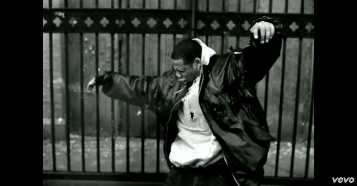
1: Music videos demonstrate genre characteristics such as stage performance in a rock video, dance routine in pop.
This is shown in Jay Z's '99 Problems' as sympathy is created with the use of black characters who are seen as criminals. The use of Brooklyn as a setting coincides with the rap genre as stereotypically places like Brooklyn are known to have 'ghetto' communities as it is heavily populated with black and mixed race people. There are various shots of religious objects which could refer to the sterotype of many black people being religious. In addition there are conventional close ups of chains, costumes, breakdancing- which could be seen as another stereotype, and dog fighting.

2: There is a relationship between lyrics and visuals. (illustrates, amplifies, contradicts).
In the music video, women are used as a commodity and are also used for the Male Gaze. It can be suggested the lyrics provide details of Jay Z's life which could also refer to mistreatment he possibly faced from authority- also in the music video the police officers are shown to be white which could further emphasis racial issues faced. The camera cuts to a man dressed in tradiontional African clothing when Jay Z says 'African' - this could further show the relationship between the lyrics and visuals.


3: There is a relationship between music and visuals (illustrates, amplifies, contradicts).
The music is fast paced and the editing of the video is in sync with the beat of the song. The use of black and white in editing could also reflect the gloomy atmosphere of the song. In addition, the audience could suggest the song sounds aggressive which could coincide to the scenes in the music video such as the scene of the gun fight towards the end.
4: The demands of the record label will incude the need for lots of close ups of the artist and the artist may develop motifs which recurs across their work (a visual style)
Through the use of low angle close ups Jay Z is represented as superior to the audience, almost 'god-like'. The use of close up's allow the audience to immerse themselves in the song and into the video.

5: There is frequently reference to notion of looking (screens within screens, telescopes, etc) and particular voyeuristic treatment of the female body.
The music video cuts to woman dressed provocatively and also dancing in a sexual manner. In addition, as the video is shot in Brooklyn it can be suggested the video's use of showing the community allows the audience to see the rougher side of Brooklyn.

6: There is often intertexual reference (to films, TV shows, other music videos etc)
It can be suggested Jay Z's 99 Problems created intertexuality for other music videos- he could be referencing himself in the video.
Music Video Timeline
Advances in technology have turn music videos to what they are today.
1920: Jazz musicians,such as Bessie Smith, started making short films to accompany popular songs.
1965: Bob Dylan's Subterranean Homesick Blues which was a segment for D.A Pennebaker's 'Don't Look Back' was widely credited as one of the first modern music video.
1970: Record industries discover TV shows as a great opporunity to promote artists. There was a focus on producing short 'promos', early music videos replaced live performances of the artist on the TV stage.
1975: 'Groundbreaking' video released by Queen - Bohemian Rhapsody. The video switched between performance in studio and their performance on a live stage. The clear use of special effects marked the beginning of the music video as it set the language for modern videos.
1980: Releasing a music video to accompany a new single had become a standard.
1990: A number of technical codes became common -
- Most common form of editing associated with the music promo is fast cut montage.
- Many images are impossible to grasp on the first viewing thus ensuring multiple viewing.
- Split screens, colourisation are also commonly used effects.
- Non-represenation techniques in which music artist is never shown became common.
- Lack of edits such as long takes/steadic are also common.
- However, genre developed music video directors increasingly turned to 35mm film as preferred medium while others mixed film and video.
Lesson 1
Technical codes- Cinematography
As with any moving image text , how the camera is used and how images are sequenced will have a significant impact upon meaning. Camera movement, angle and shot distance all need to be analysed.In addition, camera movement is also used to create a more dynamic feel to the stage performance such as circling a band as they perform.
A common convention of music videos use a range of close ups of the artist, it is sometimes used to create a sense of intimacy for the viewer. Commonly artists lip sync in their music videos which emphasise half of the commodity on sale -not just the song but the artist and the particular voice.
Technical codes - Editing
Many music videos have a fast cut montages of various images. However, videos also use slow pace and gentler transitions to establish the mood of the video. They are often enhanced through editing with the use of digital effects, which play with the original images to offer different kinds of pleasure for the audience. This might take the form of split screens, colourisation and blockbuster film styles CGI.
Development of technical codes:
Key innovation in the development of the modern music video such as video recording and editing processes along with development of numbers pf related effect s such as chroma-key or green/blue screen.
Advent of high-quality colour videotape recorders and portable video cameras enables pop acts to produce promotional videos quickly and cheaply in comparison to the relatively high cost of using film.
Subscribe to:
Posts (Atom)